Before I start my storyboard I thought it would be a good idea to look at the ways Disney frame their scenes and use this as inspiration. I want to look at the more older examples of Disney films, as this is what I have talked about a lot in my essay.
The first example is from Alice in Wonderland and I really liked this shot as it shows the house in the distance and the character coming out of the forest as if revealing it to the audience. I also really like how the forest is in shadow and the house in the light as it makes it stand out even more. This would be a good shot to use for the first sight of the cottage in my own narrative as my character walks home.
I put in this example as it shows how Disney use a midshot but she is ever so slightly placed to the left of the frame so I will keep this in mind for my own midshots.
This shot I liked because it has a lot of depth to it and I think I would like to use a shot like this as one of my first shots of my character walking through the forest. I like how the trees frame the shot nicely almost encircling the characters.
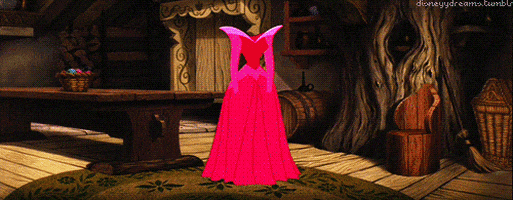
Finally, this shot is going to be very important to look at as my narrative I want to follow involves my character looking in the mirror and changing from a Princess into something much different in society's eyes. I want to create a very similar look in my own animation and I feel it will be difficult to animate my character twice in one frame.
Sunday, 20 March 2016
Disney Scenes - Research
Before going to create my storyboard I wanted to look at scenes that are from Disney films to inspire me and give me some ideas into backgrounds too. The first example I am looking at it is from Beauty and the Beast as this is one of my main inspirations that I want to look at for my colour palette so that my animation looks similar to a Disney animation. This example is very bright and uses lots of oranges, pinks and purples and I want to use these colours in my own cottage to reach a similar atmosphere.
The next example I want to look at is Aurora's cottage because there is lots of examples of different parts of the cottage. I wanted to look at this for inspiration into how my cottage will physically look and use the colour palette from the Beauty and the Beast example to make up my cottage. What I like about this example is the little details on the walls as wallpaper and the painted woos around the house. There is also trees inside the house which I like but I feel like this isn't something I will put in my own cottage as it doesn't really fit my narrative I want to follow.
In this shot from Aurora's cottage I like the big rug on the floor and I'm going to take this and put it into my own backgrounds to animate on. I also like the use of lots of wood so I want to use this as well to make my cottage very old fashioned but still fitting into the Disney aesthetic.
Friday, 18 March 2016
Sabella, Sabella!
Here are the final designs for my Princess Sabella, in both her full forms! I wanted the change to be very drastic and push on the ideas that a woman has to be certain ways to be beautiful so I made the Sabella transformation almost look like she's alien. I concentrated a lot on the idea of having a skinny waist as this is something that is present in all Disney animations and is a unattainable thing that they portray. I also decided that Sabella Two shouldn't have ears just to make her look that little bit weirder!
Monday, 7 March 2016
Concept Art Speed Paint
Here is just a nice little video I made when painting some concept art for my visual response, I was looking at different cottages and beauty and the beast concept art to create this piece.
Wednesday, 2 March 2016
Semiotics - Lecture Notes 1
Introduction to Semiotics
The ‘science’ of studying signs or meaning
A code is a system of symbols or signs
Example: the tie, it has no purpose but it's a symbol designed to convey meaning, it's there to set a conventional code
Anything can be a code, the camera angle, the lighting, the expected plot of a narrative, genre
Codes are found in all forms of cultural practice - codes rely on a shared knowledge
In order to make sense of cultural artefacts we need to learn and understand their codes
Theory:
Signifier = Sound Image (Element of the sign that initially triggers meaning)
Signified = Mental Concept (the thought or feeling evoked by the signifier)
So, signifier + signified = sign!
There is no logical relationship between the signifier and signified in language and instead this relationship is arbitrary, it is decided by the culture
Denotation: basic understanding
eg- dog… ‘Four legged creature’ etc.
Connotation: associational meanings
eg- dog… ‘Loyalty’ ‘companionship’ ‘walks’
Colour Palette Inspiration!
Before beginning the backgrounds for my visual response I wanted to look at colour palettes that Disney use in their animations so that my own animation will be more relevant to my theme of Disney. Below I have put a few different colour palettes that I four quite interesting to look at, I want to pick one of these palettes to take inspiration from.
I really like the colour palette used in Beauty and the Beast and I feel like this is also an animation that plays with gender stereotypes more than others. I want to take this colour palette and use it for my backgrounds and characters and I have found a few images of the backgrounds that I also want to take inspiration from. By taking direct inspiration instead of choosing my own I feel it will make my animation come together more and overall be more successful!
Hopefully I will be able to recreate these backgrounds in my own way and I really like the painted style of them as they almost feel realistic! I also like how they make use of really warm colours which I why I prefer this colour palette in comparison to the others.
Subscribe to:
Posts (Atom)