This context of practice module has been a great way to look at animation as not only a form of entertainment but also a medium to send a message, and has also given me the opportunity to analyse animation as a genre instead of just take it as is.
I approached this module with little knowledge about the context behind animation and I have learnt from lectures and seminars that there are many different layers and ideas behind it as a subject. As I didn't know much before starting this module, it allowed for me to be very open minded about the topics we looked at, however I decided that the topic 'how does animation construct our ideas of gender' was the most interesting out of the ones we were given. I really enjoyed researching different sources and looking at different animations in seminars that I may not have come across myself and I think that this has really opened up my ideas about animation and that it can come in so many different forms.
The practical side was really interesting as I was able to apply what I had been researching to this side of the module and even though the essay and research was my favourite part I still found this was really useful to allow myself to have a hands on experience with the topic. I felt that in this part of the module I could have created a better animation as in the principles as my character could have moved more smoothly and it's all a little robotic. As I had researched a lot into Disney, it was easy for me to create a certain style with my animation and this wouldn't have worked as well without doing so. I can take from this that I definitely need to work on my practical skills in animation to make a more effective one, however I feel that this is something that will come with time. On the other hand, one of my strengths within this module was that I was able to managed my time very well with lots of time to tweak and go over my essay.
If I were to approach this module again I wouldn't pick another topic as I enjoyed looking at this one so much, however I think I would have spent a little bit more time working out my frames and inbetweens to get a smoother animation. I also may have liked to try a different medium such as stop motion or oil to create my animation as I might have played it safe by choosing to work digitally. Furthermore, what I can take from this module is that I need to experiment a little more with my mediums that I choose to use and this way I will get a better outcome and also everything I have learnt about the genders in animation and how they are portrayed. This has opened my eyes to the power that you have as an animator and should always consider the way that the audience can take it and how this may effect them.
Showing posts with label COP1. Show all posts
Showing posts with label COP1. Show all posts
Wednesday, 27 April 2016
COP Visual Response - Animation Evaluation
Here is my finished animation as visual response to COP1 called 'Sabella' :)
My aim was to create an animation that tackled the subject of gender in animation and how it is represented, so I wanted to play with the idea of Disney Princesses.
In this animation I have created my own Disney princess Sabella, and it shows her walking home to her cottage and once getting inside revealing her true self to the audience. I wanted my message in this animation to be series, however I still wanted it to have that quite comedic effect to it as well. I used a Disney soundtrack for the first part of my animation to really establish the atmosphere and late used a heavy metal track to show the funny side to things.
Tuesday, 19 April 2016
Title Cards in Disney!
As part of my animation I wanted to spice it up and really make it feel like a Disney animation and when going to make titles I thought of just putting the plain white text on a black background but then I thought back to Disney's beautiful titles card that they use. I thought that it would be fun to recreate some of my own by using inspiration so below are a few title cards that I really liked.


Even though Disney still make modern title cards for the films I especially like the old technicolour animations as the style is much more appealing and magical to me. I have taken inspiration from a couple of their title cards and made my own which are shown below! It was really fun making these title cards and in the future I would like to make more if I get to make any more animations that are in this style.


Monday, 18 April 2016
More Progress!
So I am actually done with all of my scenes now and I am so relieved! All I have to do now is piece them all together and come up with my final animation. Below I have put a few line tests.


I had lots of fun animating these two scenes as they were meant to be comedic but also sending the message I wanted to get across about how gender is not something that can be defined by the way you look. These scenes worked really well I found, however if I were to do anything different I would make her corset throw a little quicker as if she put more effort into it. It seems to fly out of the way magically, but the animation is set in a magical world which might just save me!
Tuesday, 12 April 2016
Progress and Line Tests!
I have been making very good progress with my visual response and overall I am very happy with my outcomes, I have really been focusing on trying to make my animation seem quite comedic and something I am going to have to really think about it the sound I am going to use. Below I have put a few line tests of a couple of scenes I feel I have almost completed so far.


Here is the first walk scene that I have created and I feel like this is progress in comparison to my last project where the walk scene was quite weak and didn't look very natural. My main weakness, however with this scene is the arms seem to move around too much and it is not very natural feeling. If I have time I want to go back and change this but with the deadline being near I'm not sure I will have time to do this.

This scene is one of my favourites as it is the reveal of her true identity, this was really fun to animate and I think I pulled it off quite well as I have never done anything like this before. I feel like there are too many frames when she goes to wipe her face at the very beginning so I might take a few out here to make it a little faster.
Sunday, 20 March 2016
Disney Framing
Before I start my storyboard I thought it would be a good idea to look at the ways Disney frame their scenes and use this as inspiration. I want to look at the more older examples of Disney films, as this is what I have talked about a lot in my essay.

The first example is from Alice in Wonderland and I really liked this shot as it shows the house in the distance and the character coming out of the forest as if revealing it to the audience. I also really like how the forest is in shadow and the house in the light as it makes it stand out even more. This would be a good shot to use for the first sight of the cottage in my own narrative as my character walks home.

I put in this example as it shows how Disney use a midshot but she is ever so slightly placed to the left of the frame so I will keep this in mind for my own midshots.

This shot I liked because it has a lot of depth to it and I think I would like to use a shot like this as one of my first shots of my character walking through the forest. I like how the trees frame the shot nicely almost encircling the characters.

Finally, this shot is going to be very important to look at as my narrative I want to follow involves my character looking in the mirror and changing from a Princess into something much different in society's eyes. I want to create a very similar look in my own animation and I feel it will be difficult to animate my character twice in one frame.
The first example is from Alice in Wonderland and I really liked this shot as it shows the house in the distance and the character coming out of the forest as if revealing it to the audience. I also really like how the forest is in shadow and the house in the light as it makes it stand out even more. This would be a good shot to use for the first sight of the cottage in my own narrative as my character walks home.
I put in this example as it shows how Disney use a midshot but she is ever so slightly placed to the left of the frame so I will keep this in mind for my own midshots.
This shot I liked because it has a lot of depth to it and I think I would like to use a shot like this as one of my first shots of my character walking through the forest. I like how the trees frame the shot nicely almost encircling the characters.
Finally, this shot is going to be very important to look at as my narrative I want to follow involves my character looking in the mirror and changing from a Princess into something much different in society's eyes. I want to create a very similar look in my own animation and I feel it will be difficult to animate my character twice in one frame.
Disney Scenes - Research

Before going to create my storyboard I wanted to look at scenes that are from Disney films to inspire me and give me some ideas into backgrounds too. The first example I am looking at it is from Beauty and the Beast as this is one of my main inspirations that I want to look at for my colour palette so that my animation looks similar to a Disney animation. This example is very bright and uses lots of oranges, pinks and purples and I want to use these colours in my own cottage to reach a similar atmosphere.

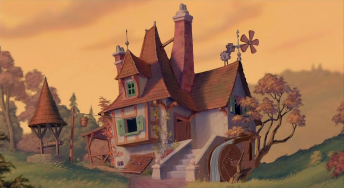
The next example I want to look at is Aurora's cottage because there is lots of examples of different parts of the cottage. I wanted to look at this for inspiration into how my cottage will physically look and use the colour palette from the Beauty and the Beast example to make up my cottage. What I like about this example is the little details on the walls as wallpaper and the painted woos around the house. There is also trees inside the house which I like but I feel like this isn't something I will put in my own cottage as it doesn't really fit my narrative I want to follow.

In this shot from Aurora's cottage I like the big rug on the floor and I'm going to take this and put it into my own backgrounds to animate on. I also like the use of lots of wood so I want to use this as well to make my cottage very old fashioned but still fitting into the Disney aesthetic.
Friday, 18 March 2016
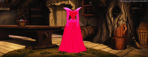
Sabella, Sabella!
Here are the final designs for my Princess Sabella, in both her full forms! I wanted the change to be very drastic and push on the ideas that a woman has to be certain ways to be beautiful so I made the Sabella transformation almost look like she's alien. I concentrated a lot on the idea of having a skinny waist as this is something that is present in all Disney animations and is a unattainable thing that they portray. I also decided that Sabella Two shouldn't have ears just to make her look that little bit weirder!


Monday, 7 March 2016
Concept Art Speed Paint
Here is just a nice little video I made when painting some concept art for my visual response, I was looking at different cottages and beauty and the beast concept art to create this piece.
Wednesday, 2 March 2016
Semiotics - Lecture Notes 1
Introduction to Semiotics
The ‘science’ of studying signs or meaning
A code is a system of symbols or signs
Example: the tie, it has no purpose but it's a symbol designed to convey meaning, it's there to set a conventional code
Anything can be a code, the camera angle, the lighting, the expected plot of a narrative, genre
Codes are found in all forms of cultural practice - codes rely on a shared knowledge
In order to make sense of cultural artefacts we need to learn and understand their codes
Theory:
Signifier = Sound Image (Element of the sign that initially triggers meaning)
Signified = Mental Concept (the thought or feeling evoked by the signifier)
So, signifier + signified = sign!
There is no logical relationship between the signifier and signified in language and instead this relationship is arbitrary, it is decided by the culture
Denotation: basic understanding
eg- dog… ‘Four legged creature’ etc.
Connotation: associational meanings
eg- dog… ‘Loyalty’ ‘companionship’ ‘walks’
Colour Palette Inspiration!
Before beginning the backgrounds for my visual response I wanted to look at colour palettes that Disney use in their animations so that my own animation will be more relevant to my theme of Disney. Below I have put a few different colour palettes that I four quite interesting to look at, I want to pick one of these palettes to take inspiration from.


I really like the colour palette used in Beauty and the Beast and I feel like this is also an animation that plays with gender stereotypes more than others. I want to take this colour palette and use it for my backgrounds and characters and I have found a few images of the backgrounds that I also want to take inspiration from. By taking direct inspiration instead of choosing my own I feel it will make my animation come together more and overall be more successful!


Hopefully I will be able to recreate these backgrounds in my own way and I really like the painted style of them as they almost feel realistic! I also like how they make use of really warm colours which I why I prefer this colour palette in comparison to the others.
Monday, 22 February 2016
Gender in Animation - Examples!
Before going any further with my visual response to my essay I wanted to look at actual examples of where gender is represented in animation and to see if there are any trends. As my essay mainly explored Disney I thought it would be best to make my visual response taking the characters of Disney and recreating them so I will be looking at Disney characters.

Here are some of the most recognisable characters to people and very influential to children female Disney characters and they all actually have similar features.
A lot of the characters feature very thin waists and I have found an image where someone has taken Belle's waist from Beauty and the Beast and made her a 'normal' size. I feel like this is something that is important as the characters have unattainable body types and this may be to make them more appealing as they are moulded around different shapes, but at the same time having the characters look like regular people wouldn't necessarily make them unappealing. \
\
Another thing I have noticed is that they have huge eyes and below I have found images that show what the princesses would look like if they had normal sized eyes. This is something I can take again in my visual response as I want to create my own disney characters and use the stereotypes to my advantage.


Here are some of the most recognisable characters to people and very influential to children female Disney characters and they all actually have similar features.
A lot of the characters feature very thin waists and I have found an image where someone has taken Belle's waist from Beauty and the Beast and made her a 'normal' size. I feel like this is something that is important as the characters have unattainable body types and this may be to make them more appealing as they are moulded around different shapes, but at the same time having the characters look like regular people wouldn't necessarily make them unappealing.
 \
\Another thing I have noticed is that they have huge eyes and below I have found images that show what the princesses would look like if they had normal sized eyes. This is something I can take again in my visual response as I want to create my own disney characters and use the stereotypes to my advantage.


Digital Culture & Distribution
There is two different views towards digital culture: utopia and dystopia
Introduction of mechanical production (1436) - Johannesburg Gutenberg’s printing press
The integration of design and mass production (1919-1933)
The globalisation of digital production (1990) - First Apple Macintosh to sell for less than US$1000
The democratisation of digital distribution - First computer that brought digital to the homes of people, it was very simple
The mobilisation of digital communication - Smartphones became available to everyone
Blogging was the next big wave in communication after web activity and email
The Digital Aesthetic - Digital visualisation, clear and precise
The Mechanical Aesthetic
The Technological Aesthetic - Future view of how we aspire technology to look
The Analogue Aesthetic - Digital is starting to go back to the retro and handmade ways even though it's still digital
Nostalgia V Innovation - the innovation has a problem as it keeps going backwards to get ideas
‘All media exist invest our lives with artificial perceptions and arbitrary values’ - Marshall McLuhan (1911 - 1980)
McLuhan believed that to fully grasp the impact of a new technology, one must examine figure (medium) and ground (context) together.
Where we are going has to be based on what we as a culture have experienced so far.
We have all of the aesthetics at our disposal to use, and the digital revolution is something that is the biggest advancement since writing or printing
1990 - Tim Berners-Lee : Created the World Wide Web and gave it away for free
1995 - Bill Gates : Created Internet Explorer and the first globally adopted web browser.
Colour Theory Lecture Notes
What do we mean by colour?
Physical → Physiological → Psychological
Spectral colour is a colour that is evoked by a single wavelength of light within a visible spectrum. A single wavelength, or a narrow band of wavelengths generates a monochromatic light.
Rods - Conveys shades of black, white ands gray.
Cones - Allows the brain to perceive colour. (When a single cone is stimulated, the brain receives the corresponding colour)
Joseph Albers (1888-1976) - Interaction of Colour
Johannesburg Itten (1888-1967) - The Art of Colour
Primary, secondary and tertiary colours.
Subtractive colour, subtracting the colour as you start to mix it, film and prints. (CMY)
Additive colour, adding colour as you start mix it, CRT monitors. (RGB)
Colour has dimensions, it has a range of different qualities and values.
Chromatic Value = Hue + Tone + Saturation
Make it darker = Shades
Make it lighter = Tints
Combination of both = Tone
The meaning of colour is presented by the way we see the other colours around it, it will affect how we perceive the colour.
Post-Modernism Lecture Notes
Modernism: initially born out of optimism, an inspirational reaction to WW1, with a view of embracing new technology and building the future.
Post-modernism: an attitude toward modernism, a rejection, exhaustion and pessimism, accepting that we can't know everything so what's the point in trying.
They somewhat overlap…
- Modernism - expression of modern life/technology/new materials/communication
- Post-modernism - a reaction to modern life/technology/new materials/communication
Origins of Post-modernism
- 1917: German writer Rudolph Pannwitz, spoke of ‘nihilistic, amoral, postmodern men’
- 1964: Leslie Fielder described a ‘post’ culture
Pop-Art (First post-modern art movement)
- Used found images and blew them up and printed them on a large scale
High-art / low art divide
- Andy Warhol - reveals the flaws in technology and he was anti-art, said it was ‘meaningless’
Modernism Lecture Notes
Modernity & Modernism
Terms - ‘modern’, & ‘modernity’
John Ruskin (1819-1900)
Modernity - industrialisation, urbanisation, the city
1900 - Urbanisation, life is shifted into the clock of the factory and created a rationalised form of existence and things began to be invented to create leisure such as the cinema.
Railways started to come about and places were more accessible and there became a world time that everyone had to agree on.
Enlightenment - Period in late 18th century when scientific /philosophical thinking made leaps and bounds.
Human ditches God in favour of the modern and the new
The City - It almost becomes the major figure of modernity, modern is unapologetic and overtakes the historic.
The word modern makes things nowadays seem better and if that label is on something it's looked at in a different light.
Modern artists’ response to the city
Paris - Haussmann (city architect) redesigns Paris, created large boulevards in favour of narrow streets and this made it easier to police, a form of social control. The centre becomes an upper class zone as the dangerous elements of the working classes are moved away from the centre. A city design the accommodate the modern but also for control.
Caillebotte & Manet - art shows how life is becoming isolated and explores the alienation from the world and being overwhelmed.
The Flaneur - Wore their fancy modern clothes and walked round the city just to be seen
Modern art and photography
Kaiserpanorama (1883) - viewing machine, why would someone pay to see the world instead of going and seeing it themselves, technology takes over our senses and the idea of a reliance on technology.
Max Nordau - Degeneration (1892), (anti-modernist) and predicted his worries of the modern world.
If we think about subjective experience (the experience of the individual in the modern world) we start to understand modern art and the experience of modernity.
Modernism in design
- Anti-historicism
- Truth to materials
- Form follows function
- Technology
- Internationalism
Wednesday, 10 February 2016
Study Task 4
TRIANGULATION
Different authors have considered the idea of the modern world has been consumed by the advertising industry and this is having an impact on culture and society. Garland, (1964), Adbusters (2000) and Kalman (1998) have all discussed the fact due to this creatives in the world are having their talents exploited or wasted by corporation and advertising business. For example, Kalman in Fuck Committees (1998) writing in his account of individuals with 'jagged passion' facing the corporate world points out that 'creatives are now working for the bottom line'. This points to the idea that as the corporate world gets larger and richer, it causes other parts of the industry lose creativity and individuality in order to use 'corporate strategies' and serve to make the riches richer (Kalman, 1998:1).
Different authors have considered the idea of the modern world has been consumed by the advertising industry and this is having an impact on culture and society. Garland, (1964), Adbusters (2000) and Kalman (1998) have all discussed the fact due to this creatives in the world are having their talents exploited or wasted by corporation and advertising business. For example, Kalman in Fuck Committees (1998) writing in his account of individuals with 'jagged passion' facing the corporate world points out that 'creatives are now working for the bottom line'. This points to the idea that as the corporate world gets larger and richer, it causes other parts of the industry lose creativity and individuality in order to use 'corporate strategies' and serve to make the riches richer (Kalman, 1998:1).
VISUAL ANALYSIS/SYNTHESIS - Starbucks Coffee Perfection
Here is an example of a stop motion animation that has been created for Starbucks Coffee. Ken Garland might say that the animators here have 'flogged their talent' and as it is so perfectly created this could possibly be the case. Each scene effortlessly flows into the next and makes use of the coffee cups as materials for the animation itself. The narrative is done by an american man who has a friendly voice, possibly a 'hidden persuader' and this could suggest the brands motif and message of being a company that audiences can trust. The colour theme is very in keeping with the brand and this is another way the animation is extremely branded and relative to the product it is promoting. I have also found that the characters involved in this animation are faceless, which could have been done so that the audience can put themselves in their place and it's easy to do so. Overall, I feel that this animation has been created very cleverly and doesn't include a single other suggestion of any other brand, focusing the audience on one thing; the coffee.
Starbucks Coffee Perfection from Rogier Wieland on Vimeo.
EVALUATION
Adbusters' manifesto 'First Things First' (2000), explores the issues that surround the world of advertising and demonstrates the idea that artistic talents are being wasted on this consumerist industry where pointless garbage is pushed out each day, but we together should challenge this. In doing so Adbusters can help us to see the ways that sitting back and allowing this happen is actually making the situation worst and we as designers should looking for 'other things more worth using our skills and experience on' (Adbusters, 2000:1). The weakness in Adbusters' argument in that they fail to account for movements where people are trying to make differences and explain that 'designers then apply their skill and imagination to sell dog biscuits' (Adbusters, 2000:1). It is possible however, when exploring Kalman's (1998) argument on the ways that designers are being swept up into corporate committees that he accounts that it is 'only 99 percent true' (Kalman, 1998:1). This develops Adbusters argument on the generalisation of designers in the industry as other authors such as Kalman (1998) believe that it is almost entirely true as a judgement.
PARAPHRASING & ANALYSING
Writing in The Guardian (1964), Garland claimed that consumerist culture was only concerned with the buying and selling of things and that design as a whole is not something that's course should be laid out for you by education, practice and industry. Garland also aims to demonstrate how important it is to not overlook the relationship between advertising and design and the need for 'reversal of priorities'. He does this by bringing a long list of examples to the readers attention including 'dog biscuits', 'diamonds' and 'butt toners' (Garland, 1964:1).
LINKS
http://www.manifestoproject.it/ken-garland/
http://www.manifestoproject.it/adbusters/
http://www.manifestoproject.it/fuck-committees/
Thursday, 10 December 2015
Harvard Referencing Notes
ORDER:
Surname, Initial., (Date), 'Title', Place, Publishers
Example: Miles, R., (2015), 'Reference', Leeds, LCA Publishers
IN-TEXT CITATIONS
'Quote' (Surname, Date: Page number)
Example: 'I argue against this point as..' (Miles, 2015: 7)
INTERNET SOURCES
Adding Onto Reference: [Internet] Available <www.linkgoeshere.com> [Accessed 10/12/15].
Add a page if necessary. P.57.
REFERENCING A FILM OR ANIMATION
Title, (Date), Dir NAME [type of media], Place, Company, Run-time.
Example: Frozen, (2013), Dir Wes Craven, [Animation], USA, Disney, 1hr 52mins.
NOTES:
- If you cannot find the author you can put whoever published the information
- It doesn't matter about the style you choose, just pick one and stick to it
- BE CONSISTENT
- If there is no author completely, then put 'anon'
- A Bibliography has to be alphabetically ordered, and it's a good idea to section it into types
- If there is multiple authors put: Miles, R. and Smith, J.
- If there is a collection of authors put Miles, R., etal
- If you can't find a date on a webpage, put the date at the bottom of the page
- If you really cannot find any date put (n.d) - no date
Tuesday, 17 November 2015
Lecture Notes - Print Culture & Distribution
Mass Image Culture
New Royal Academy - first formal art school and the school or the royals and elites of society, people who went here were taught that there was a particular idea of the fine arts, a hierarchy of the artistic disciplines. (Painting, sculpture, architecture, music, poetry)
The Making of the English Working Class (1963) - the side effect of the city and urbanisation, for the first time in England you had a condensation of people forced together, condensed cultures and a noticeable separation between the classes. Because of their separation from the galleries and Royal academies, people started to make and write their own art and culture for the people. The working people also started to then create their own political culture.
John Martin (1820) Belshazzar’s Feast - managed to beat the system as he took this painting and sold reproductions of his painting and made lots of money off it. Because of the new print culture the everyday man would now be able to own great pieces of art, which they wouldn't have ever been able to before.
Culture VS Popular Culture
Culture: ‘the best that has been thought & said in the world’, study of perfection, attained through disinterested reading, writing and thinking, the pursuit of culture, seeks ’to minister the diseased spirit of the times’ What he meant was that all of the print culture was a threat to Englishness and that this new direction is a bad route to go down and it was fine as it was. (Matthew Arnold - 1867) ‘Culture and Anarchy’
Leavism - F.R Leavis & Q.D. Leavis -
- Still forms a kind of repressed, common sense attitude to popular culture in this country
- For Leavis - C20th sees a cultural decline, standardisation and levelling down
Opinions of culture are always political
- Collapse of traditional authority comes at the same time as mass democracy (anarchy)
- Nostalgia for an era when the masses exhibited an unquestioning deference to (cultural) authority
It's not made with a rule book and it's a radical movement that is revolutionary.
School of Design (1836) - forefathers of our art schools, they had a specific role to train people for industry and had a political role of teaching print culture, institutions that celebrate traditional culture alongside mass culture
‘Aura’ and the Politics of Print
(Creativity, Genius, Eternal Value, Tradition, Authority, Authenticity, Autonomy, Distance, Mystery), Aura is all of these things and more and the impression that you get when you look at a piece of art and are amazed by the talent. It's people talking about paintings in fancy words to describe how amazing they are and making art more special than it is. This is all down to you believing that someone is better than you, more talented than you and this way of thinking makes fascism possible as it creates a culture where people are happy to be lead and dominated.
Once you can take that image and mass print it, it takes away the aura that surrounds pieces of art and you can make it into anything you like. Introduced the capacity to write their own culture and is not only the culture of the people but also introduced the opportunity for people to fight back against authority, this is the weapon. Behind this is the construction of the people where they don't blindly listen to what others tell them any more.
Contemporary Print Culture
The Panorama - People set up these images of the city and urban space, people could view these godly images and art becomes more like a experience.
Th invention of the photograph created the idea of being immortalised forever in a photograph available for everyone and the need for painted portraits became redundant.
Once you grasp the idea of political, historic possibilities it can be used as a weapon.
Subscribe to:
Posts (Atom)